
Estimation and heat plot
Content covered in last tutorial:
- Categorical distribution plots
- Boxplot
- Violinplot
- boxenplot
In this tutorial we would learn about Categorical estimate plots
pointplot( ):
This plot takes the central tendency of occurrence of that plot of particular category, This plot is better than barplot for comparing central occurrence tendency. The important note about this plot is that it shows clearly only mean of each category.
Syntax: sns.pointplot( x= ‘numeical_value’,y=’categorical_value’, data=dataset_name )
Sns.catplot ( x= ‘ ‘ ,y = ‘ ‘, data = , kind = ‘point’ )

| Parameter | It’s usage |
| join | Default is True , if set to false the line joining will disappear |
| marker | When we pass hue parameter a marker box is created on the top, to change the symbol of those markers, we pass the parameter marker as a list |
| linestyles | This parameter is used to change the line type like dotted line, dashed line. If already a hue parameter is passed then use a list or just pass a string |
| capsize | To vary the size of the caps of the plot. |
| dodge | When we pass a hue parameter lines get overlapped , this parameter takes boolean . Default is set to false |
| estimator | Basically in the point plot the joining points are mean of the data what if we want median , standard deviation or mode to be the plotting point. For such requirement we have to pass a string to the estimator parameter. |
Join parameter:

Markers parameter:
Pass a list of number of elements that the hue categorical column have that number of columns.

Linestyle :

Capsize :
We have to pass a integer value to this parameter. Try to not go beyond 0 and 1.

Dodge:

Estimator:
To pass a mathematical operation , we firstly have to import that from the numpy , so that we can use that operation.

barplot( ):
These are the plots in the form of rectangles as the estimate of central tendency for a numeric value.
Syntax: sns.barplot( x= ‘ ‘, y= ‘ ‘, data= )
sns.catplot( x= ‘ ‘, y= ‘ ‘, data= ,kind= ‘bar’ )

Hue:

Linear relationship models:
Datasets contains many quantitative analysis, and relating those quantities is one of the most important part to analyze the data, and these linear model’s plot can be analyzed by using two types of plots.
- lmplot( ) #linear model plot
- Regplot () #regression plot
Regression plots:
What is regression and where they will be used, these things will be discussed in the machine learning tutorials. Just here we would plot linear regression models.
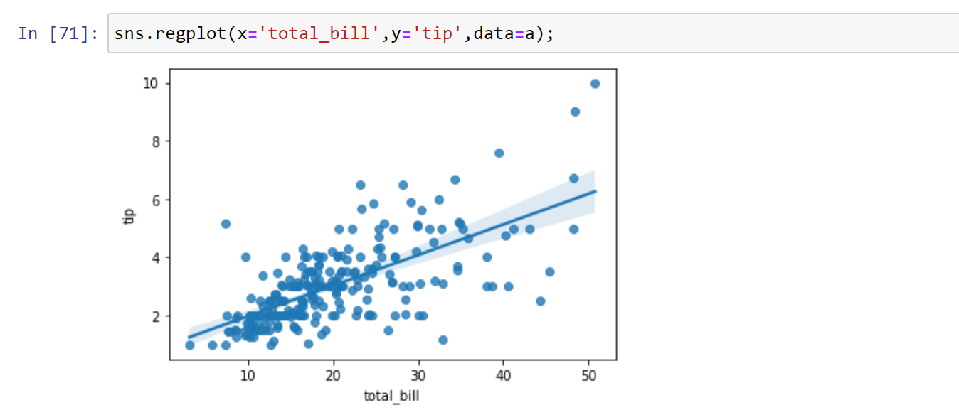
The line plotted is regression line.
Lmplot ( ):

heatmap( ):
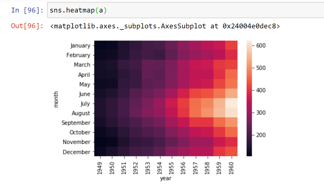
This type of rectangular plot is known as heatplot. To plot this either we have to correlate the data or construct a pivot table. Here we are working with a data set known as flights, which shows the number of passengers travelled in the flights from 1949 to 1960 during each month.

Let us create a pivot table , which takes three parameters index, columns and value.

Now we shall plot a heatmap:
Syntax sns.heatmap( pivot_table_name )

Few important parameters:
Annot
This parameter takes a boolean, and as we can see that it is difficult to read the quantity of each box, by passing this parameter as true we can read the data on each box.

Linewidths:
To create gap between the box plots. This parameter takes integer values.

Linecolor:
Basically the line that divided the box are white in color , we can change it’s color by passing the color name , color code as a string.

cmap:
To change the palette of the plot.

This was all about seaborn and plots involved in categorical values , regression ,matrix plots, Estimation and heat plot.